
How User-Friendly Websites Turn Visitors into Customers
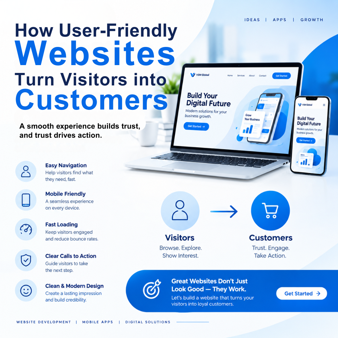
Most people do not leave a website because they dislike the business. They leave because something on the website makes them work too hard.
Maybe the page takes too long to load. The menu is confusing. The service details are hidden somewhere. Or the contact form asks for more information than the customer is willing to provide.
None of these problems may look serious on their own. But together, they can make a potential customer close the website and choose another business.
A user-friendly website removes these small frustrations. It helps visitors understand the business, find the information they need, and take the next step without feeling confused or pressured. That smooth experience is often what turns an ordinary visitor into a real customer.
Businesses investing in Website Development in Chennai are beginning to understand that a website should not only look professional. It should also feel simple, useful, and comfortable for the people using it.
What Does “User-Friendly” Actually Mean?
A user-friendly website does not make visitors stop and think about how to use it. Everything feels familiar and easy.
Visitors can quickly understand:
· What the business offers
· Where to find the required information
· How to contact the company
· What they should do next
· Whether the business can be trusted
The website does not need to explain every small step. Its layout naturally guides people.
Think about walking into a well-organized store. Products are placed in the correct sections, prices are visible, and a staff member is available when help is needed. A good website should create the same kind of experience online.
People Visit With a Purpose
Most visitors do not open a business website just to admire its design. They arrive with a specific question in mind.
“Does this company provide the service I need?”
“How much will it cost?”
“Can I trust them?”
“How can I contact them?”
A successful website answers these questions quickly. It does not force visitors to read several long paragraphs before they understand what the business does.
For example, if someone visits a website looking for mobile app development, the first section should clearly communicate that service. If the visitor has to search through unrelated information to find it, their interest may disappear.
Clear communication saves visitors’ time. It also shows that the business understands its customers.
The First Few Seconds Matter
When someone opens a website, they immediately notice whether it feels professional and easy to use.
A crowded page with too many colours, pop-ups, animations, and large blocks of text can feel overwhelming. On the other hand, an empty page with very little useful information may make the business look incomplete.
The right balance is somewhere in between.
A strong homepage normally includes a clear heading, a short explanation, a relevant visual, and one visible action button. Within a few seconds, visitors should know what the business offers and whether it is relevant to them.
This does not require complicated design. In fact, the websites that create the best first impression are often the ones that keep things simple.
Navigation Should Feel Natural
A visitor should never have to guess where a page is located.
Imagine someone wants to view a company’s previous projects. They check the main menu, but there is no Portfolio or Our Work option. After opening several unrelated pages, they still cannot find what they need.
Most people will not continue searching. They will simply leave.
Simple navigation prevents this. Familiar labels such as Home, About, Services, Portfolio, Blog, and Contact help visitors move confidently through the website.
The menu should also focus on the pages customers actually need. Adding too many options may make the website look detailed, but it often makes the experience more confusing.
A well-planned structure allows visitors to move from curiosity to interest and from interest to action.
Fast Loading Keeps Interest Alive
People are used to getting information quickly. Even a short delay can make a website feel slow, especially on a mobile phone.
Consider a customer comparing three companies. The first website opens immediately. The second takes several seconds to display its images. The third does not load properly at all.
Even if all three businesses offer similar services, the first one has already created the better experience.
Large images, unnecessary effects, poorly optimized videos, and excessive plugins can slow down a website. Improving these areas helps pages open faster and keeps visitors engaged.
Website speed may look like a technical issue, but it directly affects how customers feel about the business.
Mobile Visitors Need the Same Comfortable Experience
A website may look perfect on a laptop and still be frustrating on a phone.
Text may become too small. Images may move outside the screen. Buttons may be difficult to tap. Forms may require constant zooming and scrolling.
For a visitor, these are not small design problems. They are reasons to leave.
A mobile-friendly website adjusts itself to different screen sizes. Menus remain easy to open, content stays readable, and buttons are comfortable to use.
This matters because people often search for businesses while travelling, during a break, or after seeing a social media post. They may be ready to enquire at that moment. If the mobile experience is poor, the opportunity can disappear.
Professional Website Development in Chennai should therefore treat mobile design as a basic requirement, not an optional extra.
Clear Content Makes Choosing Easier
Businesses sometimes try to sound more professional by using complicated words. Unfortunately, this can make their websites harder to understand.
Visitors are not looking for the longest description. They want a clear answer to one important question: “How will this help me?”
Instead of only listing technical features, website content should explain the benefit behind them.
For example:
“Responsive website development” is a feature.
“A website that works smoothly on mobiles, tablets, and computers” explains the benefit.
Both statements are correct, but the second one is easier for an ordinary customer to understand.
Friendly and direct content helps visitors feel that the business is speaking to them, rather than presenting a formal sales document.
Good Design Builds Quiet Confidence
Trust does not always come from a large claim such as “We are the best company.” It often develops through smaller details.
Consistent colours make the website feel organized. Clear images show professionalism. Correct spelling creates credibility. Real customer reviews provide reassurance. Updated contact details show that the business is active.
Visitors notice these signals even when they are not consciously looking for them.
The opposite is also true. Broken links, blurry images, outdated information, and incomplete pages can create doubt. A customer may wonder whether the same lack of care will appear in the service they receive.
A user-friendly design gives visitors fewer reasons to hesitate.
Calls to Action Remove Uncertainty
A visitor may like the service, trust the company, and still leave without contacting anyone. Sometimes the website simply fails to explain what they should do next.
A clear call to action solves this problem.
It could be:
· Get a Free Quote
· Book a Consultation
· Talk to Our Team
· Request a Demo
· Start Your Project
The wording should match the visitor’s situation. Someone reading a service page may be ready to request a quotation. Someone reading a blog may prefer to explore related services first.
Buttons should also be easy to notice without appearing on every part of the screen. The goal is to guide visitors, not pressure them.
Long Forms Can Lose Good Customers
A person who wants a quotation should not feel as though they are completing a job application.
Some websites ask for a full address, company size, detailed budget, multiple phone numbers, and several other pieces of information before allowing someone to submit an enquiry.
Each additional field gives the visitor another chance to stop.
A shorter form is usually more effective. A name, email address or phone number, required service, and brief message may be enough for the first conversation.
The remaining details can be collected later.
The easier it is to contact the business, the more likely customers are to begin the conversation.
Helpful Information Reduces Doubt
Not every visitor is ready to make a decision immediately. Some may be comparing services, checking prices, or trying to understand whether a solution is right for them.
Useful content can help them move closer to a decision.
Frequently asked questions can answer common concerns. Case studies can show how the business solved a real problem. Testimonials can provide confidence. Blog posts can explain topics in a simple and practical way.
This kind of content does not need to sound like a sales pitch. Its purpose is to help visitors feel informed.
When a website answers questions before customers have to ask them, the business becomes easier to trust.
Where the Real Value Appears
A user-friendly website does more than make the page look good.
It reduces the number of people leaving without exploring. It helps sales teams receive better enquiries. It allows customers to understand services before making contact. It also reduces repetitive questions because important information is already available.
Most importantly, it creates a positive first experience with the business.
That first experience may happen before a phone call, meeting, or purchase. If the website feels clear and reliable, customers are more likely to expect the same quality from the company.
How to Improve an Existing Website
Improving a website does not always mean rebuilding everything.
Businesses can begin by checking where visitors face difficulty. Are important pages hard to find? Does the mobile version work properly? Are contact forms too long? Is the content easy to understand? Do all buttons and links work correctly?
It is also useful to ask someone unfamiliar with the website to complete a simple task, such as finding a service and submitting an enquiry. The places where they hesitate often reveal what needs improvement.
A professional Website Development Company in Chennai can study these problems and create a website structure that supports both business goals and customer needs.
VSM Global Technologies develops responsive, clear, and user-friendly websites for businesses that want a stronger online presence. Whether it is a company website, e-commerce platform, or custom web application, the focus should always remain on helping real people use it comfortably.
Conclusion
Visitors rarely become customers because of one attractive banner or animation. They become customers after a series of small, positive experiences.
The website opens quickly. The service is easy to understand. The menu takes them where they expect. The information answers their questions. The contact process feels simple.
None of these things may appear extraordinary. Together, however, they remove the uncertainty that often prevents people from taking action.
A user-friendly website does not try to impress visitors at every moment. It simply makes their journey easier.
And when a website makes it easy for people to understand, trust, and contact a business, more visitors naturally become customers.
Back to Blogs